Friday 14 December 2012

Finally Finished!

Well nearly.

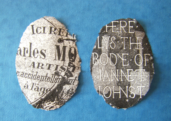
I managed to solve the problem of how to assemble "Where the dead live" a couple of weeks ago.

Earlier this week spurred on by Sara's post on BAO, I finished two copies of "Dead" to parcel up and send to her, along with two copies of Rapunzel, hoping to meet the January deadline.


I have now finished assembling the rest of the edition. I can't quite believe it. These two books have occupied me on and off for a year now. I’ve learned a lot through the process and am looking forward to the next challenge.


 I am going to wait until the New Year to send out the rest of the books. I think they’ve more chance of not getting lost and arriving undamaged if I send them after the Christmas post (so more detailed images will have to wait)

Sunday 9 December 2012

Its behind you

Just a quick note to say that I haven't fallen off the face of the earth. A combination of work (which I won't go into) and Panto have meant that the book making has had to be slotted into the odd half hour here and there.(Although I have solved the problem of how to assemble 'Where the dead live' I have not photographed it yet. And poor old Rapunzel is still sitting here waiting to be wrapped and put into the post.)

There was particularly heavy family involvement in all aspects of Panto this year. My daughter and husband wrote it, my 'adopted' daughter and my husband co-directed it, she also produced it, and all three of them were in it. I painted sets and scenery like a mad woman. (This makes it seem like just a family affair, it wasn't. Its amazing how much work and how many people it take to put on something like this)

However it was the last night last night which means we all get our lives back until we forget the pain and volunteer for the next production.

In the meantime in the absence of book related images I give you "Wind in the Willows - The Panto"


Tuesday 6 November 2012

One down, just one more to go

At last  'Rapunzel' is finally finished. Books editioned and ready for wrapping.


Tuesday 30 October 2012

Nearly there?

Did I say 'Rapunzel' was ready to print?

3 more tweaks, two more dummies and the artwork is finally finished! Happily the printer likes this version and has given me sets of prints that match, whose colours I like and without any banding.


Not only that but I've almost finished another page for 'Where the dead live'. They only need the layers putting together, although burning the edges has made the whole house smell like I lit a bonfire in my workroom.


Now all I need to do is work out how to put this book together!

Earlier this month I received a great concertina book from Estelle in South Africa. I'll post pictures when she reveals all on Book Art Object

Wednesday 24 October 2012

Time to catch up

Its half way through half term and I've had chance to put some sustained effort into my books.

I've almost finished two more sets of pages for 'Where the Dead Live'.  Joe's Cup is done, and I've only got one and a half of Alice Harrison to do.


This means just two more pages to go. For one of them I want to use the idea of seed pods and the blue commemorative plaques that we put up on buildings in the UK for interesting or famous people associated with them, but I haven't decided yet how to do this yet. Nor have I worked out how I'm going to put the pages together in the final structure.

Rapunzel is changing again. I originally thought it would be hand printed in black and white, responding to Beardsley and Arts and Crafts woodcuts/early book illustrations. When I decided to print digitally I tried to include the textures and colours of old paper and faded inks. These worked well on screen but either wouldn't output as I wanted (inkjet printer) or flaked when I folded the the print (laser printer). This week I started playing with the colours and altering the way the layers blend. It has resulted in a much more colourful image than I intended, and its more complicated than the original drawing, but I like it. However I still have to get the printer to give me at least ten uniform versions!)


Thursday 11 October 2012

How time flies.....


I can't believe its been so long since my last post. Term has started with a vengeance and so have panto preparations. This year we are doing "Wind in the willows". I really enjoy painting the backdrops, how often do you get to paint on 20ft  by 10 ft canvases.

I've been trying to persuade the printer to cooperate with Photoshop and print the colors I want for "Rapunzel". I think I've made progress and am going to risk a final dummy before hopefully printing out the whole edition.(Have I said this before!)

I've  been thinking about how to construct "Where the dead live". I want the pages to hang from the support. I have been experimenting with stitching through the pages and using eyelets.


I've been considering whether it is possible to respond to the idea of a locket as a repository for memories and using jewelery findings as part of the structure.


I thought about using metal leaf to gild or part gild the cover but couldn't find any stockists locally (I don't want to make a major internet purchase if I won't use it). Silver paint just looked awful. I'm holding fire on this until I've been to the Manchester Book Fair on Saturday I'm hoping one of the suppliers there will have something to inspire me.

Sunday 23 September 2012

One step forwards....

Although work on it has slowed down since term started 'Where the Dead Live' is making progress.
I've made another batch of pringles (if in doubt start squishing paper!) and printed another set of etched pages.


I also finished the scanning for Rapunzel and put the textures into the image last week so I thought I'd print out the final artwork and start to put it all together. I'd decided to laser print the whole edition as the test pieces and mock up I did before the holidays (using found textures) worked well even though they weren't the right colours.

All the decisions have been made and this was meant to be the easy part. The printouts looked great. The colours and the textures worked well together. The dark  had a rich leather-like feel to it. But.....

when I started to fold the prints the ink started to flake off leaving white paper showing through


It doesn't look worn and in keeping with the subject it just looks tatty.

I thought I'd print it on the inkjet instead. On printing paper it bleeds and the colours are decidedly grubby.


 So I ordered coated inkjet paper. It prints cleanly and the image is sharp but now the printer is resisting all attempts to calibrate it to the monitor and has decided it can improve on my colour scheme.


At the moment it favours custard yellow and something that can only be described as poo brown.


Wednesday 12 September 2012

Editioning pages

Although I'm not sure yet how exactly I'm going to construct this book I do want a mixture of printed and mixed media pages. I thought I'd better see how easy it was to print a uniform set of images from two plates onto the handmade paper shapes.
The amount of moisture seems to be critical. Not enough and the image won't print clearly enough, too much and the plate refuses to part with the paper and I end up scraping it off. The differences in thickness between the papers doesn't help when trying to judge this.


But I finally managed 15 of each plus one or two not too mangled ones that I can experiment with.

Saturday 1 September 2012

Etching experiments

Over the past two weeks I’ve been experimenting with etching onto the ’pringles.’


 I find cemeteries and graveyards fascinating so I’ve been looking through my collection of inscriptions on gravestones for these images. 

I started with Charles Morelli. I found this enamal and wrought iron grave marker in a cemetery in Argeles-sur-Mer. I can’t find out what type of artist he was or how he died ‘accidentally’. His wife lived to be 87, dying in 1952.


 I made the images on the plates bigger than the edges of the oval as the handmade paper isn’t completely uniform and each one spreads slightly differently when it goes through the press


I followed this up with Jannet  Johnstone. I found this stone in a cemetery on Orkney. I l really liked the form of the lettering incised into the stone and the very simple imagery carved in a shallow relief. 


I tried to use the lettering and the view from the cemetery; it looked straight out over the sea. A beautiful but bleak landscape.


Unfortunately when I transferred the design to the plate the tones didn’t differentiate as well as on the PC screen so it wasn’t very legible.


I decided instead to use some of the very simple shapes from the gravestone behind the lettering.


The images transfer to the handmade paper but the paper does tend to stick to the plate. This could be a problem when trying to edition it.